Iris is a product designer who believes in creating with a little bit of whimsy
Designing brands and interfaces for Canada’s most innovative startups, studying HCI @ UBC
Lumeno AIInternship
Parpro Consulting Ltd.Web & Brand
SetDM AIFounding
🔒
Coming Soon
Budgie FinanceApp · iOS
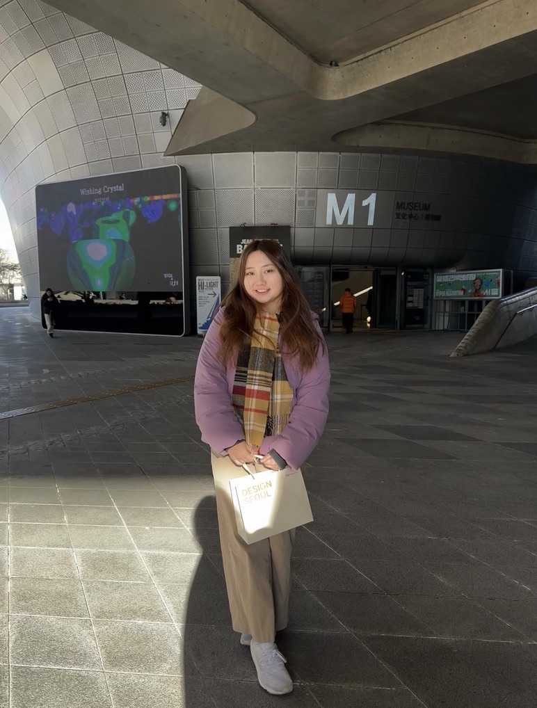
I'm Iris, like the song by the Goo Goo Dolls
I grew up heavily immersed in competitive music; it taught me professionalism, artistry, and that not being good at something is just part of learning. I transitioned into film, where craft met storytelling, and each scene I studied expanded my sense of empathy. That mindset now shapes my design practice: human-first, constantly iterative, and of course, visually purposeful. In my freetime, you can find me at pretty much any cafe in Vancouver.
Fun Facts:
I got lost in Ottawa and walked to Quebec
Voiced characters for a professional video game in Germany
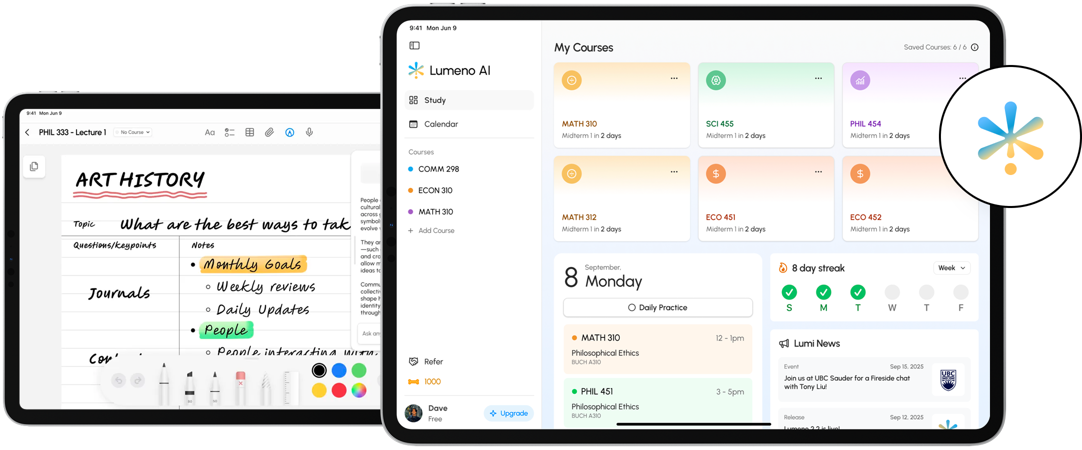
Lumeno is a study platform for university students with AI chat, flashcards, exam mode, summaries, and a digital notebook. However, beta users would consistently flag that the chat was hard to read, especially for people with ADHD or dyslexia.
A few weeks into my internship, I was tasked with running an accessibility audit to tackle this issue.
🔍 Problem
Lumeno's AI chat offers no reading customisation, giving students no way to adapt the features to their needs, leading to difficult and unusable product experiences.
Finding what the product was getting wrong
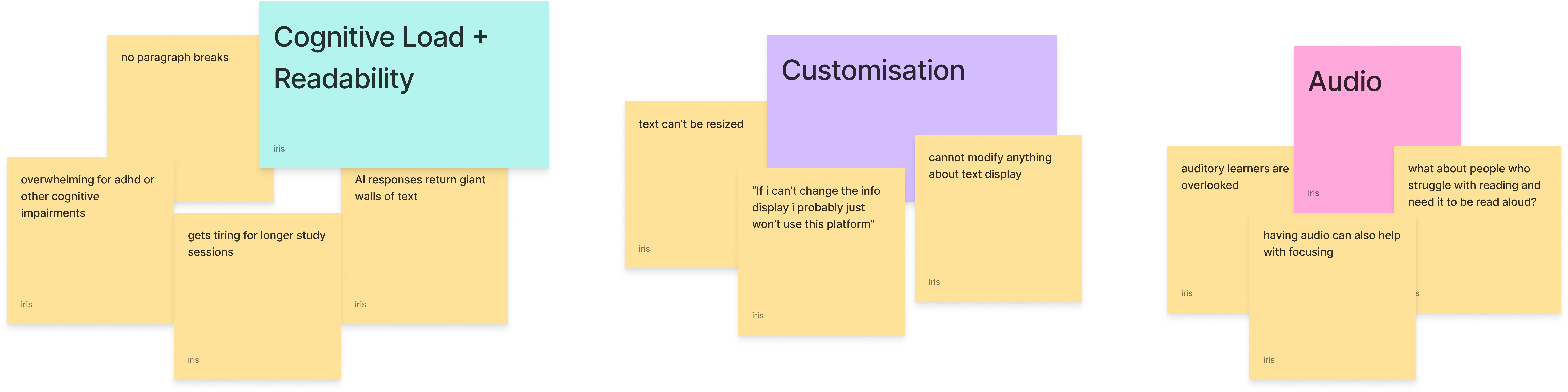
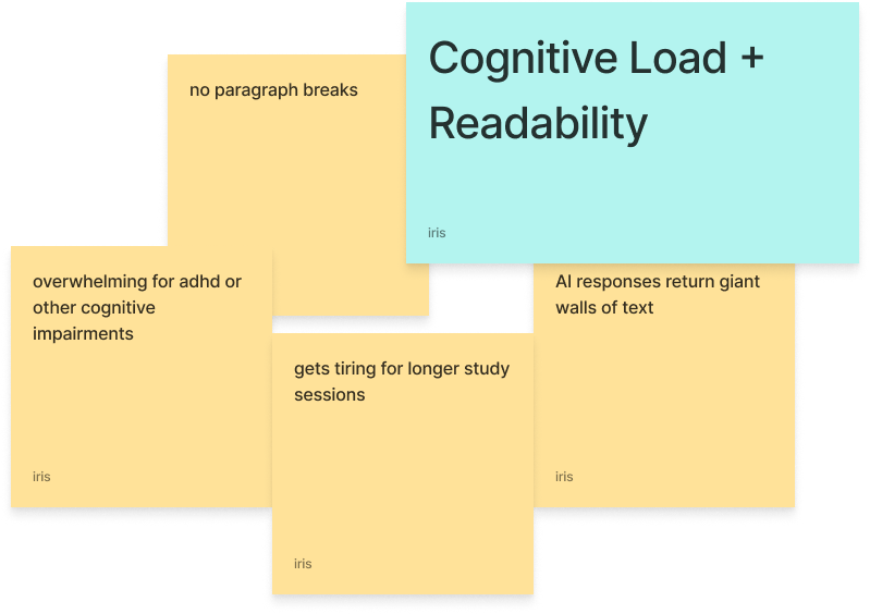
I ran a WCAG 2.2 compliance review, a heuristic evaluation of the app's key flows, and looked into the beta feedback given to us. From the feedback, I knew to prioritise tackling the wall of text the product would produce, as it was the most emphasised problem from the users.
Issue
WCAG Criterion
Level
Status
Unreadable text density in chat
The AI's responses rendered as dense walls of text with no paragraph breaks. Beta users mentioned that this was a large barrier for ADHD.
1.4.8 Visual Presentation
AAA
Fail
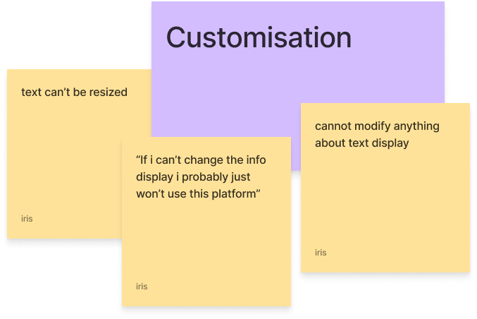
No text customisation controls
Font size and letter spacing were fixed. Students had no way to change the reading experience to make it fit their needs.
1.4.4 Resize Text
AA
Fail
Solution
The audit made clear that students had no control over how information was presented to them. The solution was to give that control back directly through in-app features.
Adjusting text size
Users can now increase or decrease font size within the app, addressing WCAG 1.4.4.
Adjusting letter spacing
We also added adjustable letter spacing; for users with dyslexia, wider letter spacing can be a significant aid when reading.
Additional Features
Speech to text
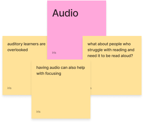
Students can say their questions aloud instead of typing, making the chatbot easier to use for students with motor difficulties.
Text to speech
AI responses can be read aloud, giving students with visual impairments or processing difficulties a more accessible experience.
What this project taught me
Accessibility should be kept front and centre
As I was given the accessibility audit task after most of the main product was already built out, it made me realise how often accessibility goes overlooked in products. My main takeaway is that accessibility should be looked at in the early stages of building a product, and not as an add-on.
Designing a funnel-based inbox and AI co-pilot for fitness coaches and DM setters managing high-volume Instagram conversations.
Role
Founding Product Designer
Platform
Web app & Meta Integrations
Timeline
1 Month
Team
CEO, CTO, and 1 Designer (Me)
Instagram DMs were never built for scale
Instagram DMs rely on Instagram's inbox as their primary sales channel. The native inbox is flat, chronological, and completely unaware of where any given lead stands in a funnel. Coaches hire DM setters (people who make sales or set up sales calls using direct messaging on social media platforms) to manage the volume, but those setters had no real tooling to work with. The lack of pipeline visibility and assistance in reducing cognitive load make it painful to stage hundreds of conversations a day sustainably.
SetDM AI is a funnel-based workspace built with AI, made specifically for DM setters to make sales faster and without burning out.
Founding Product Designer
I spearheaded the product design, working in close partnership with the founder and engineer. The founder brought deep fitness industry and sales knowledge which shaped how we approached research and prioritisation throughout the design. The full initial product was completed within a month due to the high demand and limited time.
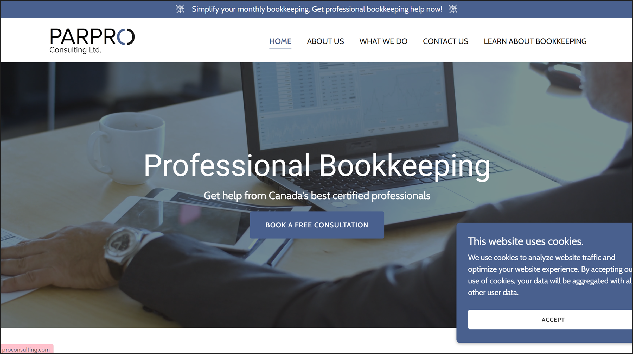
Parpro Consulting Ltd. is a Canadian bookkeeping agency serving small to medium-sized businesses. Their existing website struggled to establish trust or stand out; the over-usage of generic stock photography, static layouts, inconsistent branding, and unclear information made the site feel illegitimate and wasn't converting as well as it needed to.
Over 2.5 days, we did a full website and brand identity redesign for the FLUI Design Competition.
🔍 Problem
Parpro's current website design suffers from a weak establishment of brand identity and a lack of uniqueness, which results in diminished bookings, reduced trust, and lower engagement levels.
Getting to the root of the problem
We started by interviewing the CEO to understand the brand's needs. We began by gauging the brand identity, asking questions like, "if your company was a person, what car would they drive?", and then moved onto questions regarding his goals and current results.
From the interview, we found that the brand tone they were aiming for was clean, affordable, and "a bit boring" (as said by the CEO) and the main goal was to drive consultation bookings. The target audience was small to medium-sized Canadian businesses with high-value transactions, looking for a service that felt simple, professional, and affordable.
After the interview, we conducted three HCI tests by giving users Parpro's website. Here's what they said:
I don't see the difference between this and other consulting companies. It is not special to me.
This looks like a scam or a fake company.
The main pain points our users had
🤔 Where do I go?
Users did not know where to tap to find specific information. Navigation offered no clear signals about where to look.
💸 What about pricing?
No pricing information existed anywhere on the site, leaving users unable to self-qualify before reaching out.
😰 How do I prepare?
Users had no idea what to say for the consultation or what information to prepare, creating friction before first contact, or even deterring users from contacting at all.
🕵️ Is this legitimate?
The way the site was laid out made it appear like an untrustworthy establishment.
Competitive analysis
We swept both large consulting firms and Canadian bookkeeping providers to understand what the better-performing sites had in common: they made it easy to understand what they offered and why to trust them. Parpro's existing site did neither.
User personas
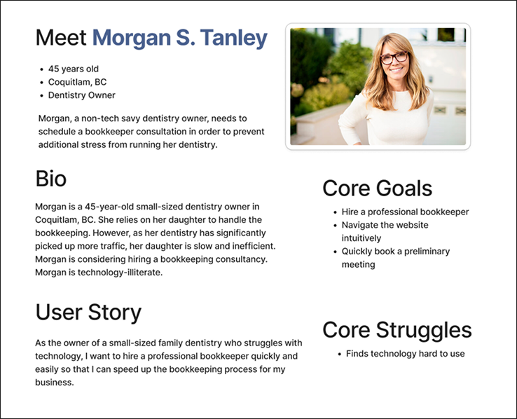
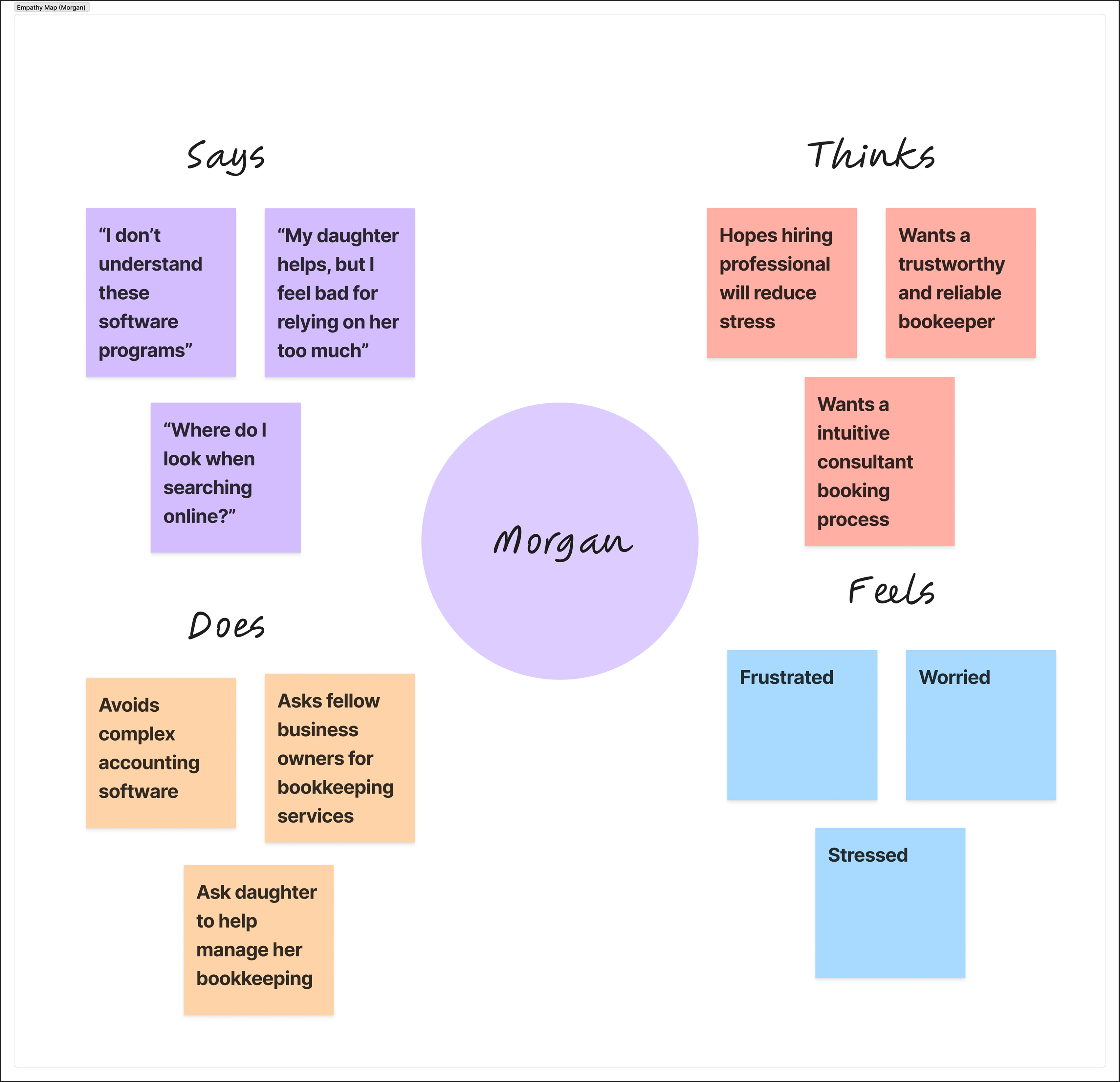
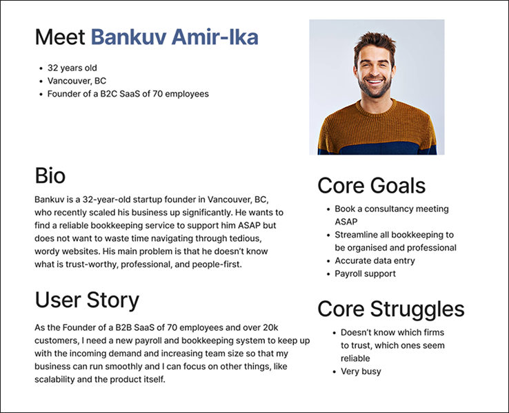
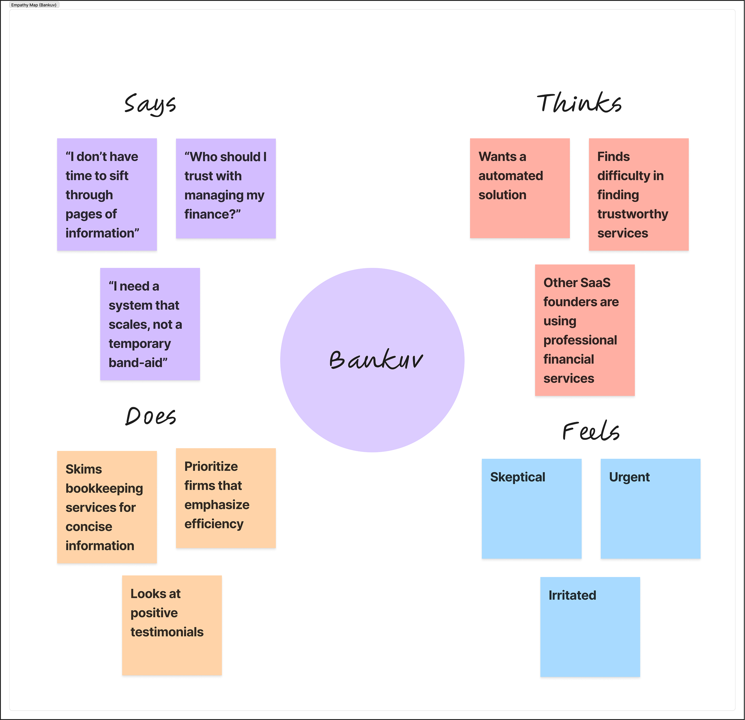
We then created personas to help with empathising. Meet Morgan S. Tanley and Bankuv Amir-Ika (no correlation with Morgan Stanley and the Bank of America, I promise), the most likely users of this service.
Starting the redesign
With research complete, we identified three specific things to prioritise for the redesign.
Build trust
Surface real client testimonials, remove misleading site elements, and clarify the contact form.
Create distinction
Redesign the logo and visual identity, add purposeful animation, and replace stock imagery with elevated photography.
Clarify information
Restructure navigation and content hierarchy, label tools and partners clearly, and replace article carousel with vertical scroll.
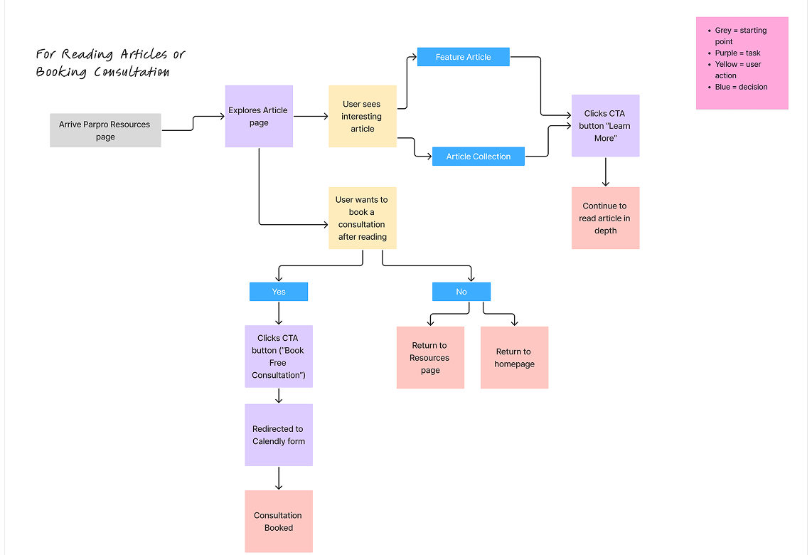
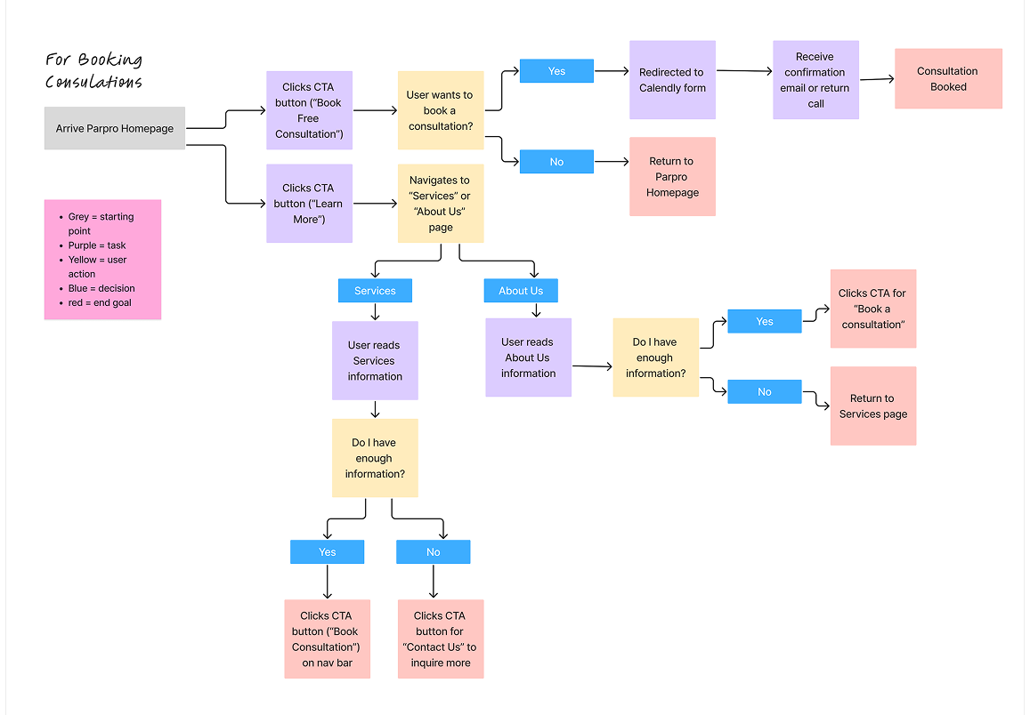
During the client interview, the founder noted that the two main ways people arrive on the site are through searching directly for a bookkeeping consultation, and through discovering one of Parpro's finance articles. We designed a separate user flow for each path.
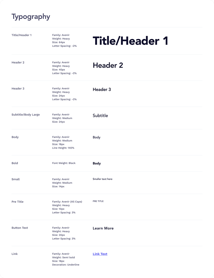
Logo, design system, and animation brainstorming
Logo redesign
We explored several logo directions, looking for something more modern that still carried the clean, professional character of the brand. The final choice was selected for its friendliness and openness while still capturing the founder's original vision.
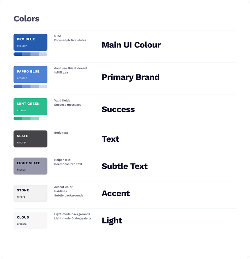
Design system
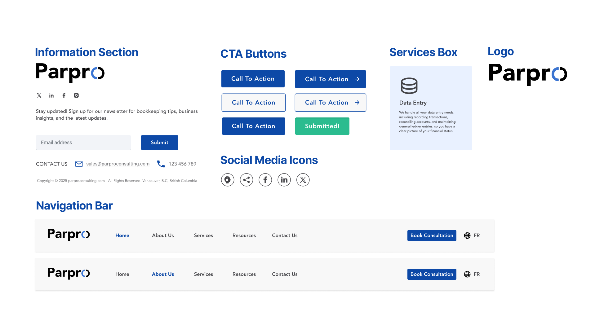
Design components
The component library covered the logo, navigation bar, information sections, services boxes, CTA buttons, and social media icons, so we could maintain consistency across the design.
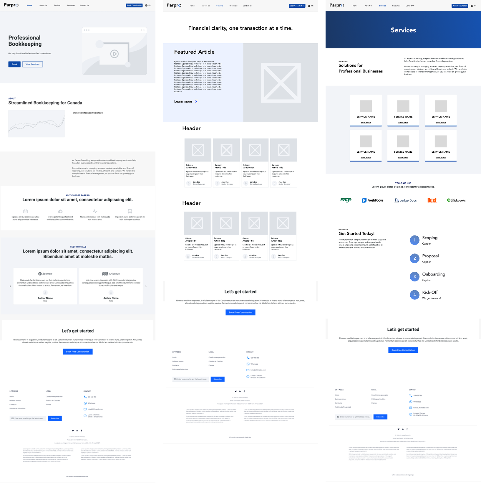
Low fidelity wireframes
The redesign across every page
Home page
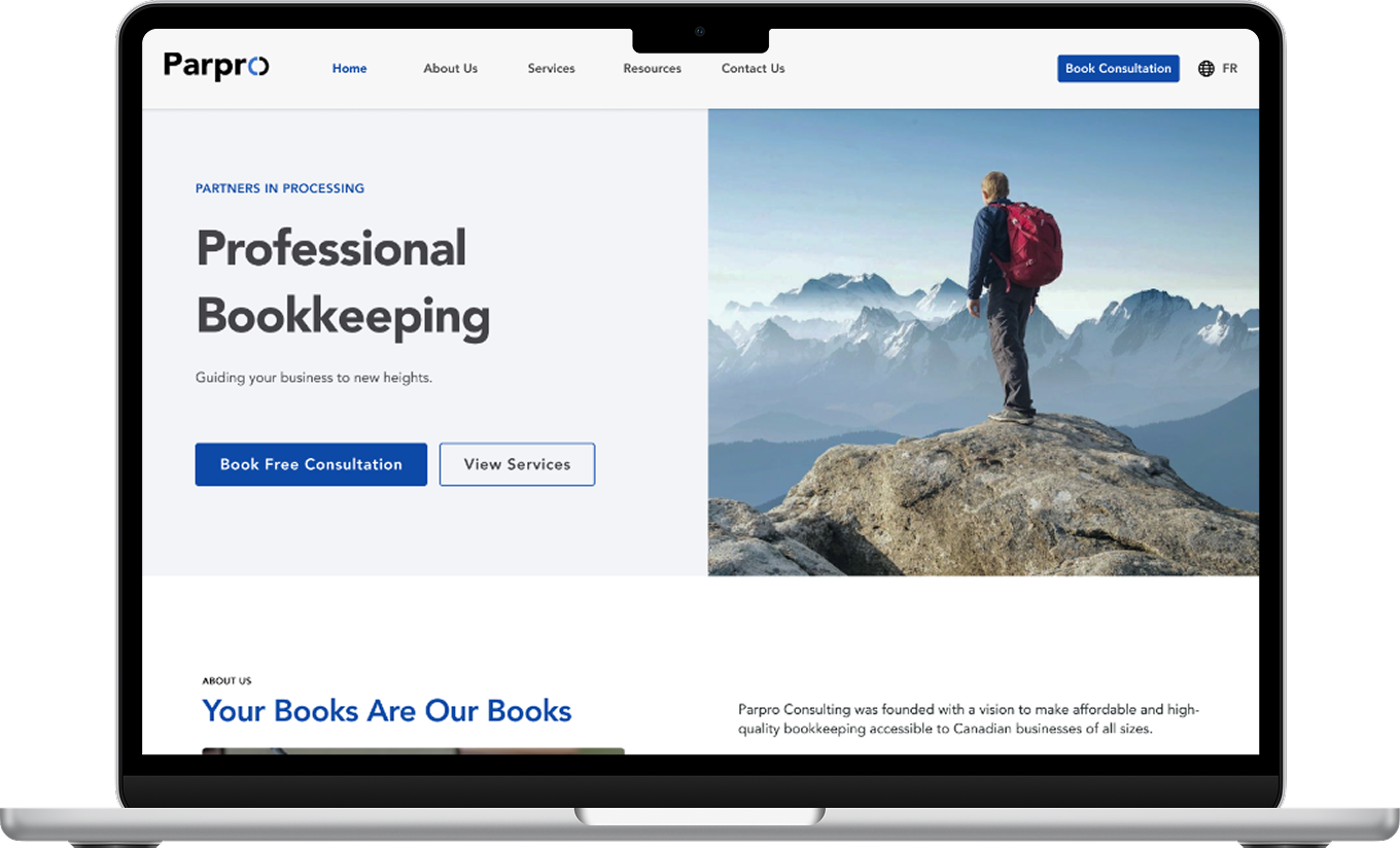
Services, testimonials, and the “Why Us” section are redesigned with clear visual hierarchy and consistent branding.
An immediate popup distracted and overwhelmed users on arrival. The testimonials and “Why Us” sections lacked both content and aesthetic appeal.
About Us
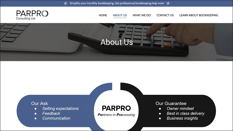
The page opens with an animation of “Our Ask” and “Our Guarantee”. On scroll, the company story and values are clearly legible. The page ends with a call to action to book a consultation.
Static visuals and stock images made the page feel generic. Company values were not listed and descriptions were too generalised to convey any personality.
Services
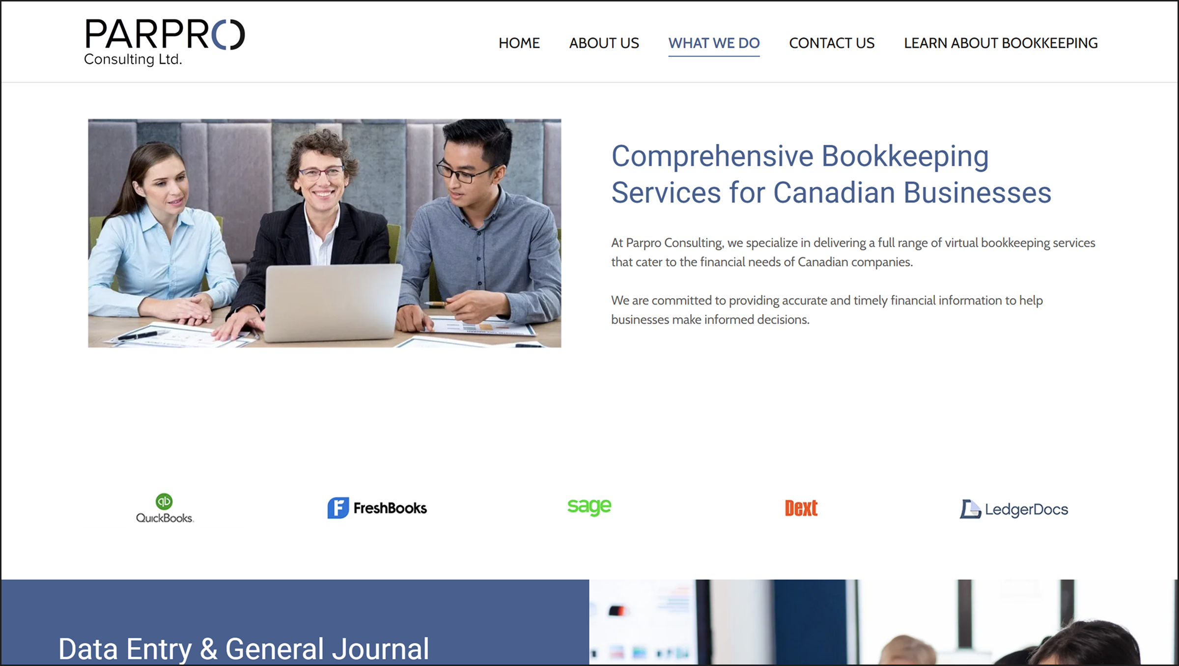
Information laid out in bite-sized squares. Logos are clearly labelled as tools the company uses.
Company logos were listed in a horizontal line with no indication of whether they were sponsors, partners, or tools.
Resources
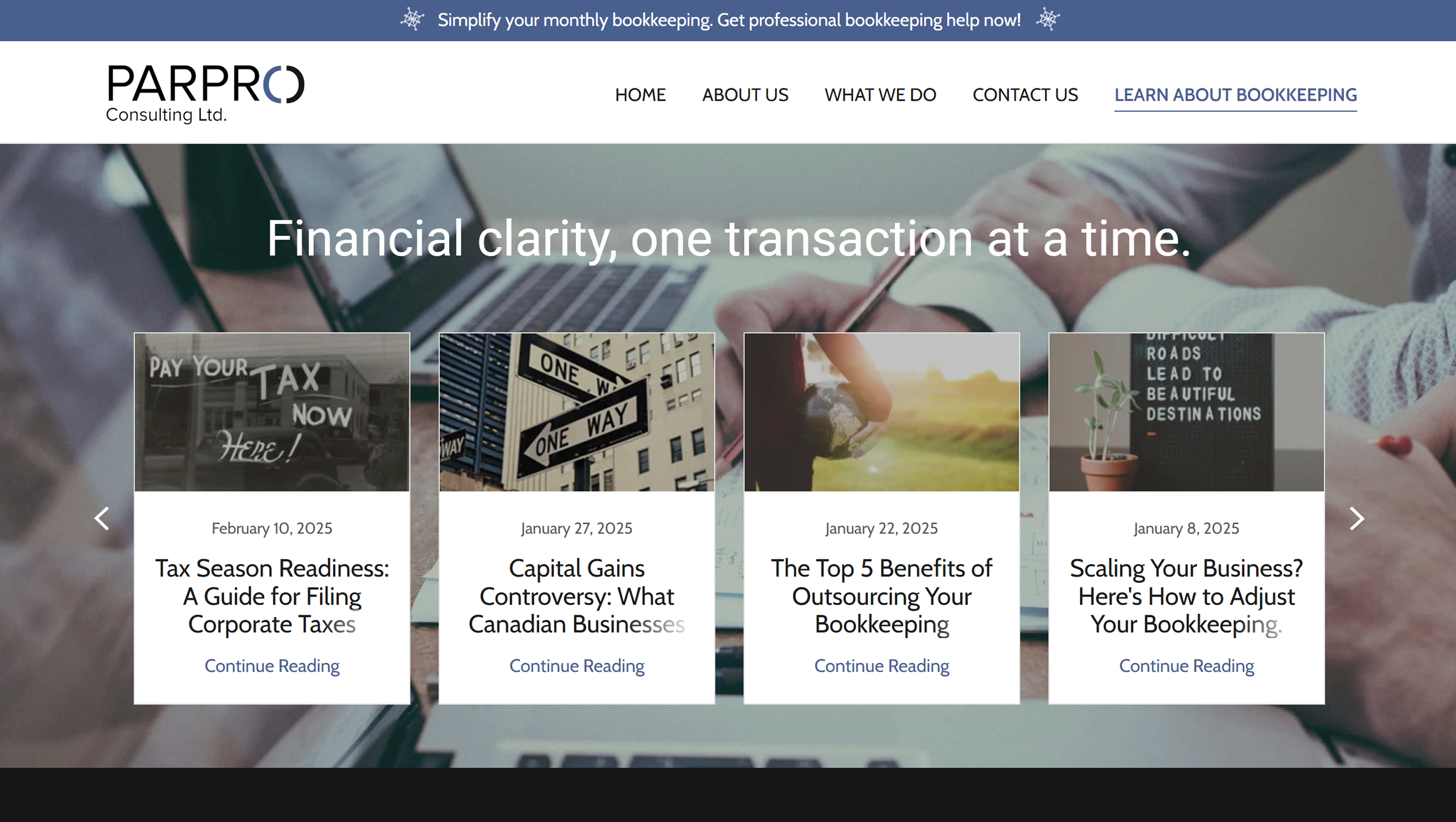
Carousel removed in favour of vertical scroll, which increases retention rates and usability. Articles are consistent in typography and end with a call to action to subscribe to the newsletter. An audio icon was added so users who are hard of hearing can have articles read aloud.
Articles were displayed in a carousel, which is poor for engagement retention. Each article was also inconsistent with the others in typography, with hierarchy issues throughout.
Contact Us
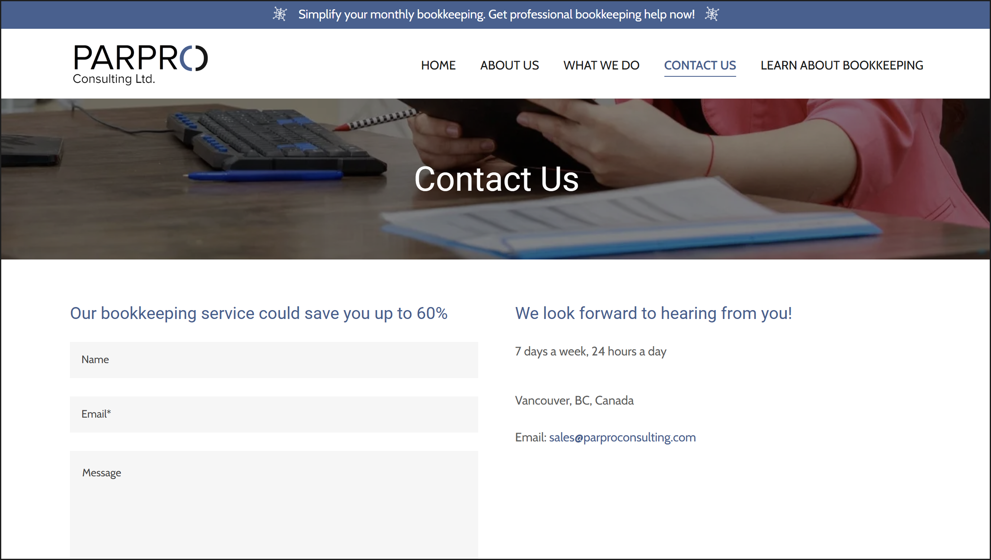
The form includes clear directions. The misleading map was removed entirely, making the brand look more legitimate and user-friendly.
The form assumed users knew how to fill it in. A map at the bottom displayed a random coordinate not registered to a real building, causing confusion and distrust.
What the redesign achieved
Higher user retention
By reducing redundant text, stock images, and unneeded features, and adding non-distracting animations, users stay engaged on the site for longer.
More accessible experience
The redesigned site is more intuitive for people who may not be tech-literate, making the experience easier and more inclusive across multiple groups of users.
Friendlier and trustworthy brand
Parpro now has a hint of personality while maintaining a professional, neat brand identity. More cohesion in the branding gives potential clients more reasons to trust the company.
What this project taught me
Designing for an audience you are not
I have never used a bookkeeping service before so this project really stressed the empathy part in empathetic design. Learning how to put on not only the potential user's shoes, but also the founder's shoes, meant taking extra time to figure out how to align the business goals with what would best resonate with a potential customer.
Branding
This was my first time being told by a client that they want their brand and website to be "a bit boring", which really taught me how to assess already existing brands so I could design towards what they wanted their image to be like. The time we spent prepping questions for the founder before our preliminary meeting and the meeting itself was a crucial part in learning about his vision, and the process of asking good questions is something that I will carry forward into future branding and design projects.
 who believes in creating
  with a little bit of whimsy